Behind the Absolut x Tomorrowland 2026 collection
One iconic stage. Three new Absolut icons.
The Tomorrowland mainstage reveal is one of the most eagerly awaited moments in the global music calendar, a defining cultural moment that unites millions of fans worldwide.
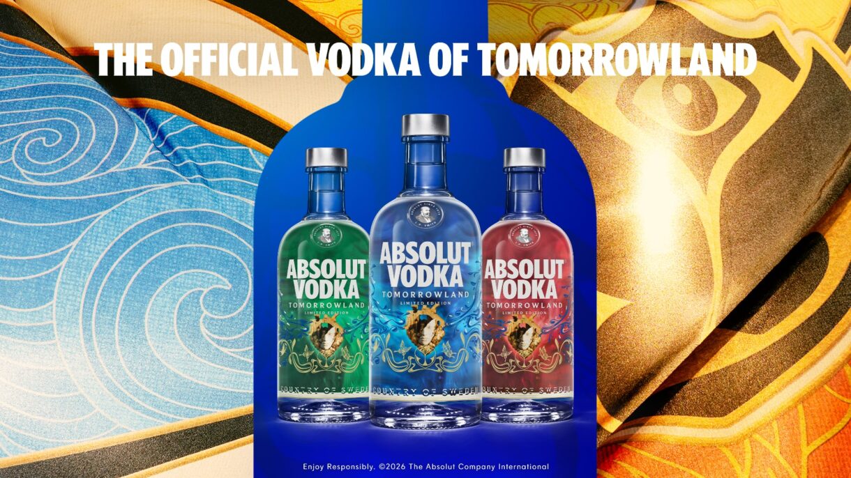
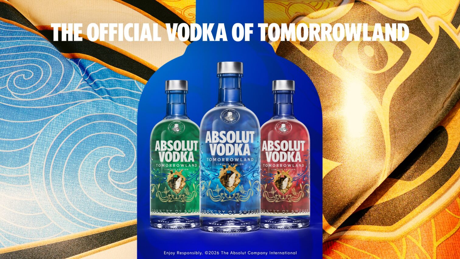
Last year, Absolut became the first – and only – brand Tomorrowland has ever trusted to bring that moment to life through an iconic limited-edition collection. This year, we’re taking it even further – giving fans their first ever glimpse of the iconic 2026 mainstage centrepiece. Three emotions. Three bottles. And for the first time in our history — gold print.
Annika Skohg, Global Marketing Manager, Experiences & Partnerships, leads the creative team that joined forces with Tomorrowland’s legendary stage artists to make it happen. We caught up with her to talk collaboration, design heritage and what it really means when two icons come together.
Last year’s Absolut x Tomorrowland collection created a huge buzz across both festival fans and design-conscious consumers. How will this year’s collection top that?
Our partnership with Tomorrowland goes back almost a decade. What began as a local sponsorship in Belgium has grown into a truly global collaboration — built on shared values, genuine creative trust, and a belief that the dancefloor should be a space for everyone.
Last year was a real turning point for us. We became the first ever partner to apply Tomorrowland’s global mainstage theme to a branded collection, and what surprised us most was how personally people connected with it.
As a brand, we’ve always sought out the boldest creative voices of each era, handed them the canvas and trusted them with it.
This year we’re going further. For the first time, fans will see the centrepiece of the iconic Tomorrowland mainstage brought to life on an Absolut bottle, which is a pretty iconic canvas in its own right. We’ve also added gold print to an Absolut bottle for the very first time, which makes it a genuine collector’s piece.
Tomorrowland has never trusted an external partner to reveal the mainstage design before, what does that say about this partnership?
It all comes down to trust and the authentic collaboration we’ve built together over the years. The mainstage design is one of the most closely guarded secrets in the music industry, but it’s bigger than that. Tomorrowland has never allowed another brand to work directly with the concept, to collaborate with their artists and bring that creative vision to life elsewhere. We are the only partner they’ve trusted to do that, and we’ve had to earn that right.
We found that whichever bottle consumers chose sparked something personal. It started conversations. That was a big learning from last year.
And when I reflect on this shift in creative direction, its rooted in something we’ve always believed in. As a brand, we’ve always sought out the boldest creative voices of each era, handed them the canvas and trusted them with it. So doing that in the festival space with a partner that has the same creative conviction feels completely true to who we are.
The collection has three editions that represent three core emotions: green, red and blue. Walk us through the thinking.
The design is based on the global Tomorrowland theme for 2026 which is built around six emotions. But for the collection, we focused on three which we felt really tied our brands together: love, joy and wonder. These emotions are each represented through a different colour: green, red and blue. Without giving too much away, it all comes together through the design’s centrepiece – but you’ll have to wait for the full reveal to see how.
You worked directly with Tomorrowland’s own stage artists on this collection. What does that creative process look like?
Creativity sits at the core of both Absolut and Tomorrowland, so for us it was never about directing the artists or defining boundaries around them. Instead, from day one, we stepped back as a brand to give them the freedom to shape the design on their own terms. That’s what makes it feel like art rather than a product.
It was about giving the stage artists the canvas and getting out of the way. It’s the same way Absolut has always worked with artists, from Warhol to Haring, and more.
That authenticity is a big part of what makes it work. When we tested last year’s bottle with our festival council, one of the things consumers said was that it was quite rare to see such an authentic collaboration.
Normally a brand might push its own identity because it’s their product, but with this design people were quite blown away by how authentic it felt. When you give an artist that level of creative freedom, it becomes a passion project that quickly turns into something authentic that resonates – especially with this generation where authenticity is everything.
Is there a detail in this year’s bottle that most people will miss but that means everything to you?
Obviously, the big reveal is the main stage centrepiece which makes it very special. But beyond that, the collection will also feature gold print for the very first time on an Absolut bottle. So that is something we’re very excited about. We’ve also added a unique detail on the shrink cap of the bottle – another brand first. Those three things will make this a collectable for sure.
For someone who will never attend Tomorrowland, this bottle might be their only connection to that world. What do you want them to feel when they hold it?
Tomorrowland is a major cultural moment for the industry, with over a million people registering each year who don’t get a ticket. For those who won’t experience it in person, we hope this bottle offers a connection to that moment and a way of being part of it in their own context.
I want them to feel that it can act as a facilitator for bringing people together – sharing a drink with friends, old or new, or marking a celebration – echoing the heart of our partnership from the start: using music and creativity as a unifying force to build a more diverse and inclusive tomorrow. For me, it’s about creating something exclusive in its craft as a limited edition, but inclusive in its experience.
A final takeaway: green, red or blue – which one is yours?
That’s a difficult choice. While blue might feel like the natural pick given our brand colours, I’d choose the green today. I really like how it turned out – we rarely see that colour on our products, and it worked beautifully with the gold details in the screen print and centrepiece. Though, honestly, I like them all.